

“Bijutsu is the combination of my two passions, the fine arts and the martial arts. I would love that whoever shares this space finds inspiration to create and to give the best of himself on the martial path.”
— Budoka
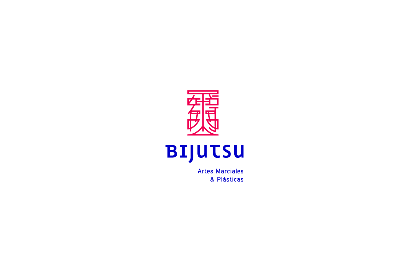
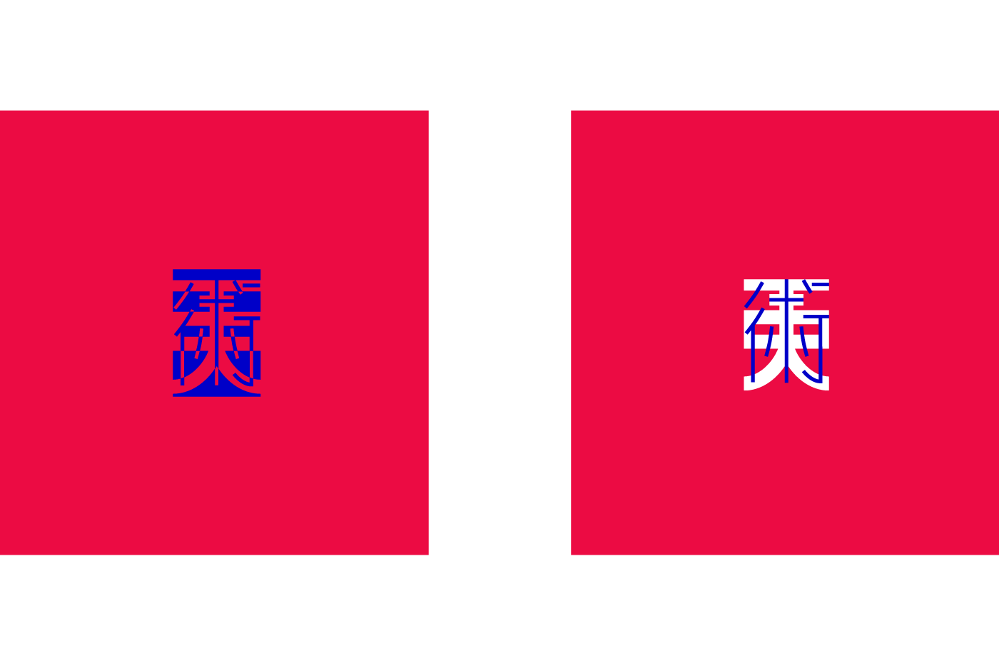
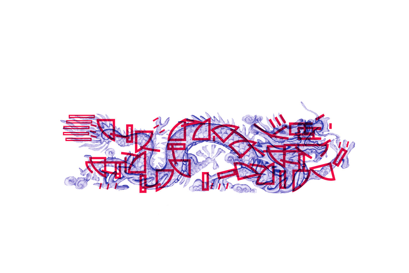
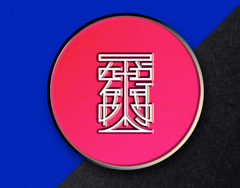
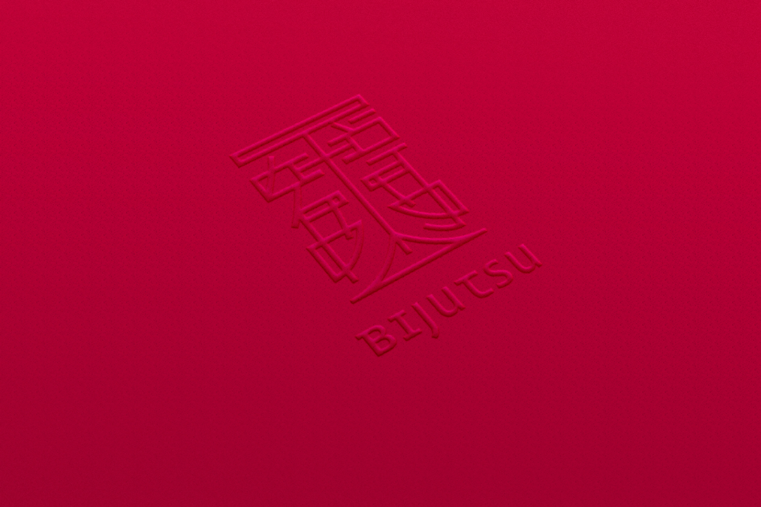
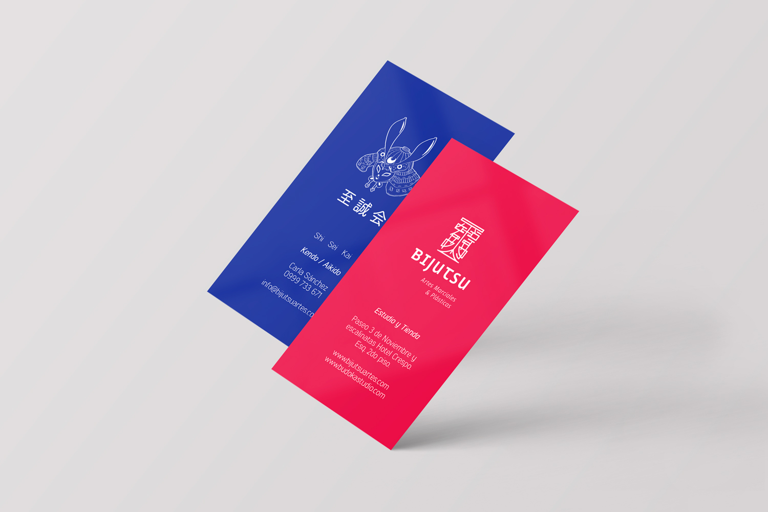
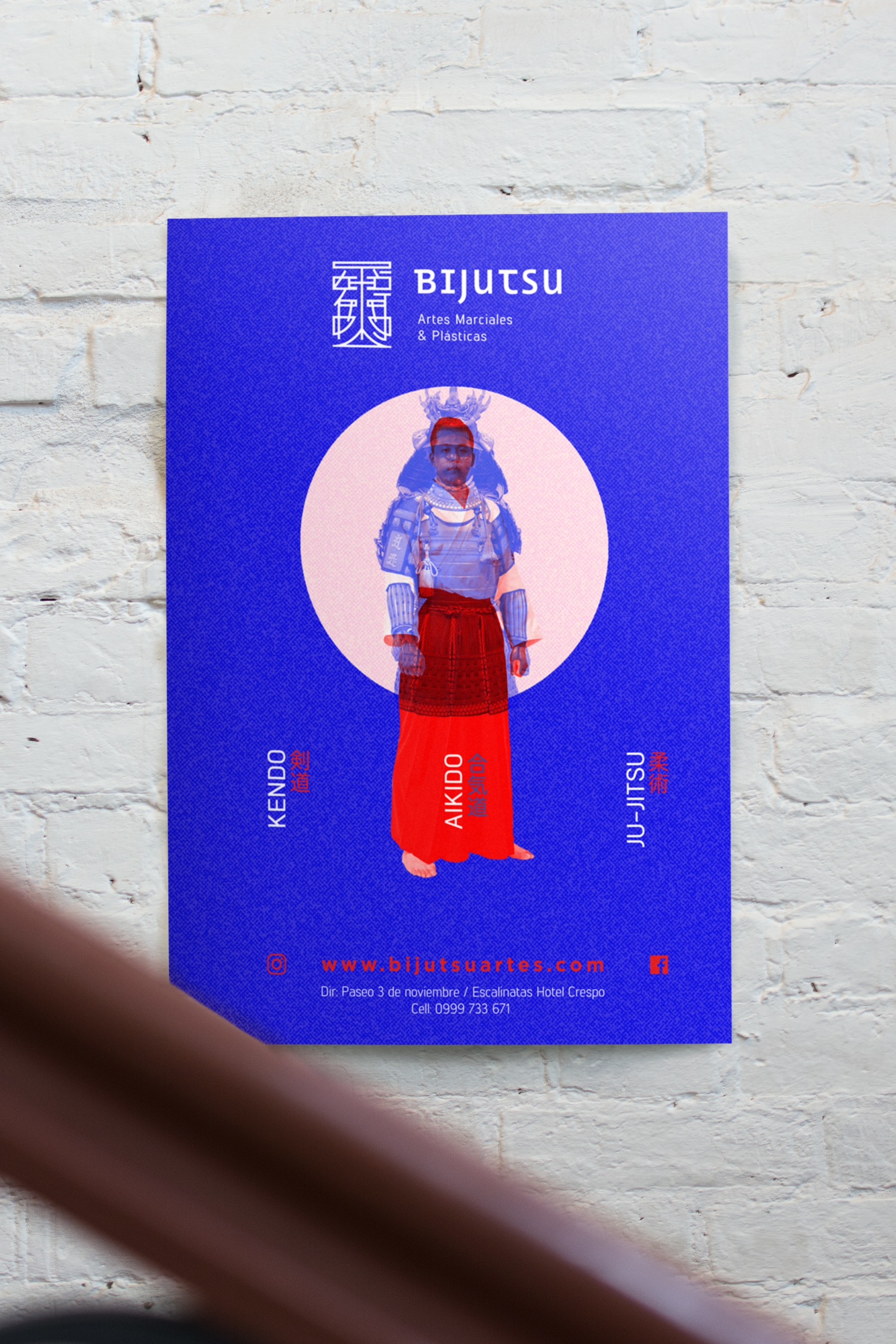
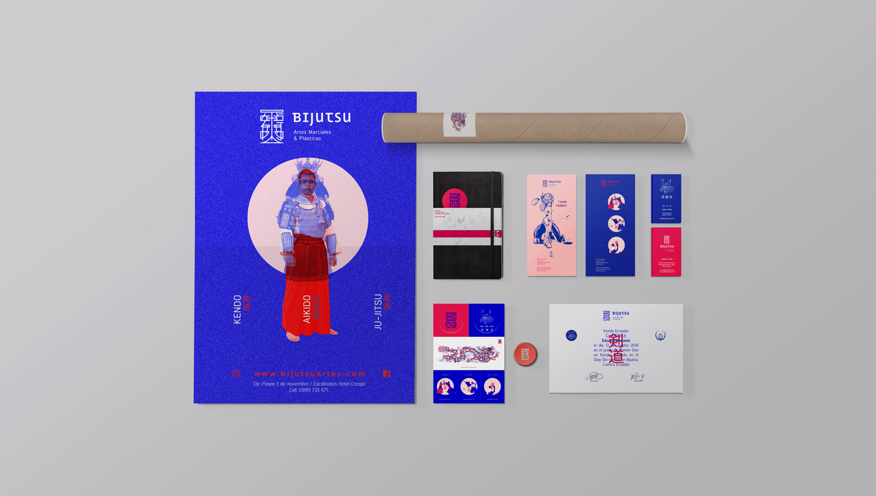
This description of our client helped us conceptualize the graphic, which we developed by combining the Japanese characters 美術 (bijutsu, that means Art) and a graphic system based on the technique of overprinting, generating an own aesthetic for the pieces of communication.
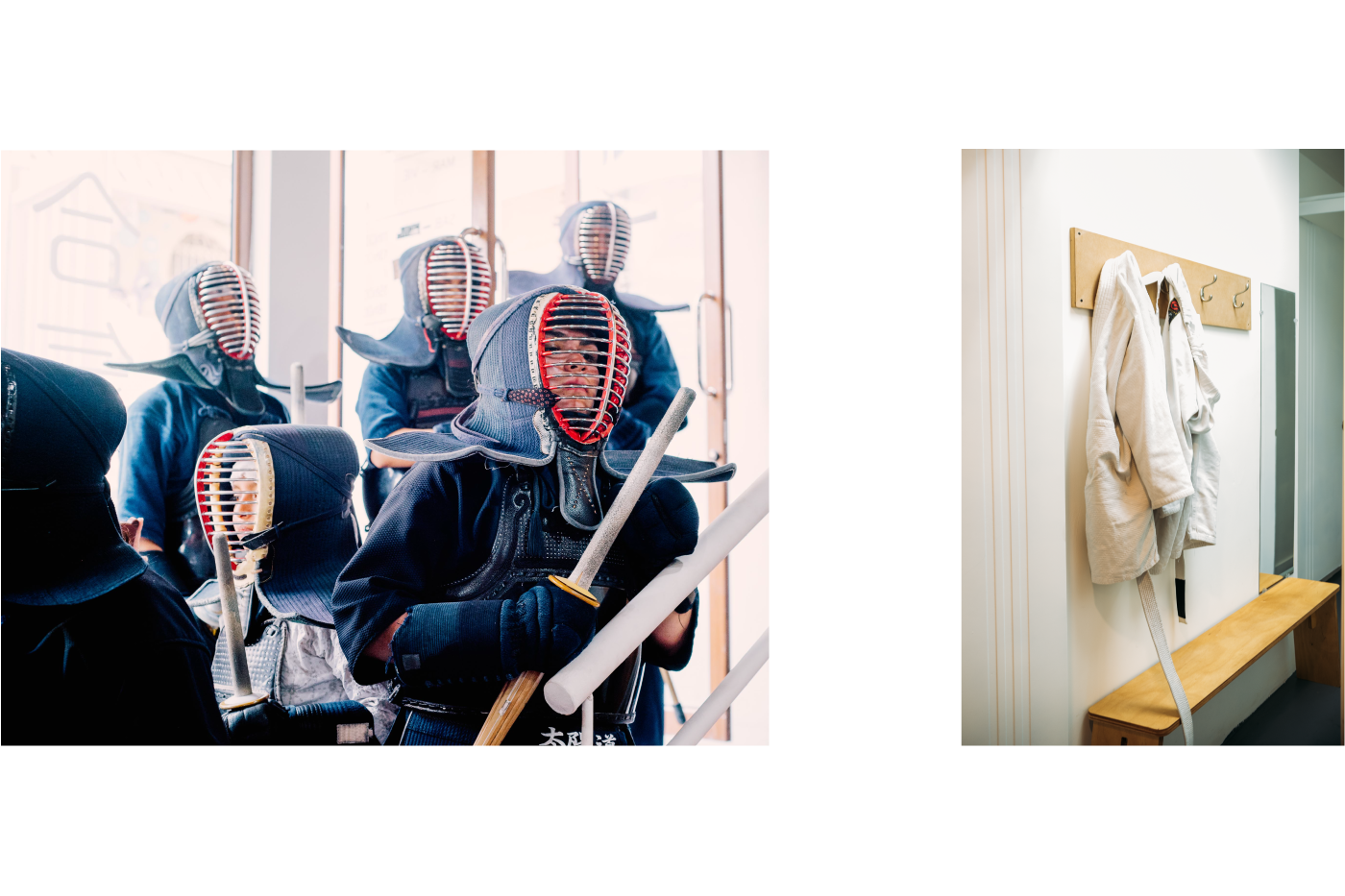
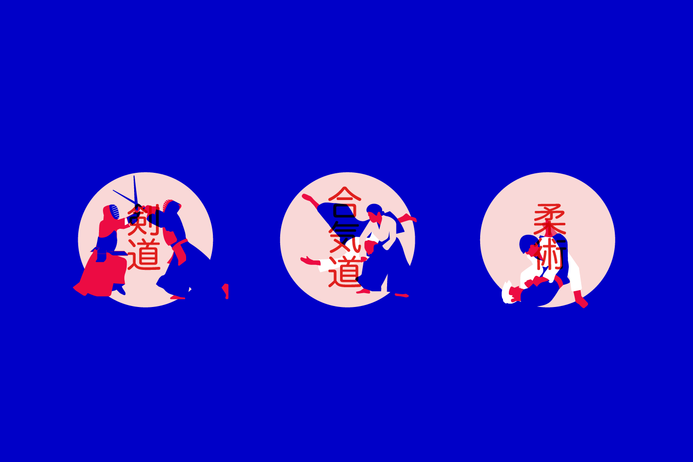
The chromatic palette reflects the concept for martial as well as plastic arts in the same space, creating differentiation when communicating the different activities, services and products (Kendo – Aikido – Jiu-Jitsu). An intense blue to represent the martial arts and a bright red for the plastic arts.
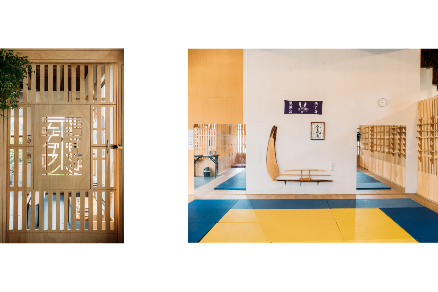
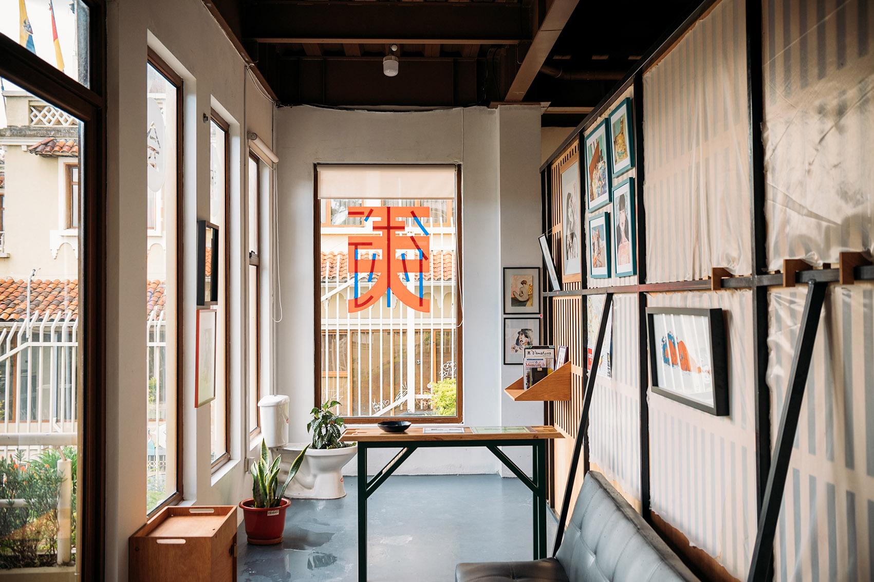
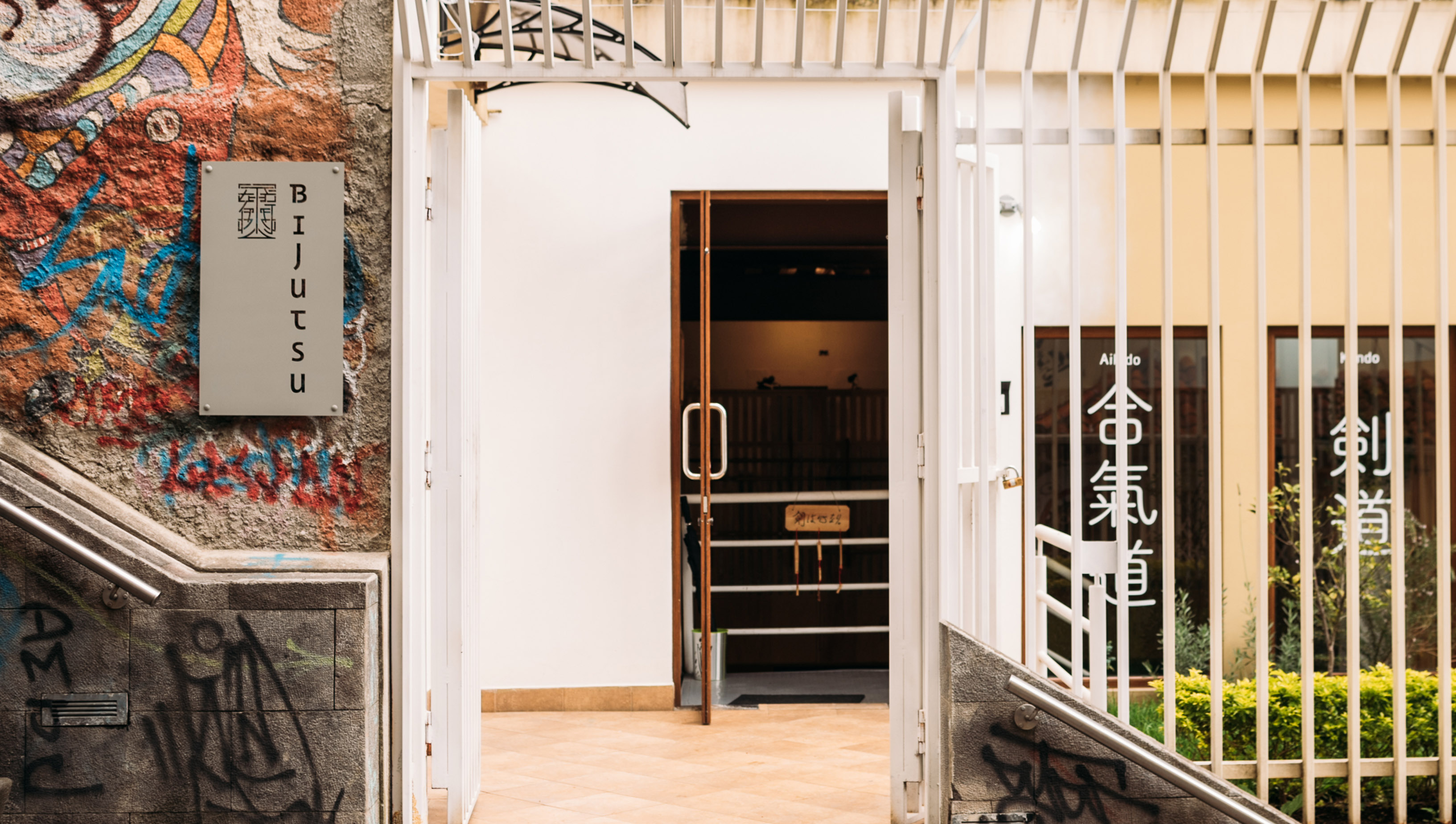
The branding in the interior and exterior space had the intention of integrating to the facade of the building as well as in the interiors with a signage that is based on the space but also managing to mark the spaces of common use.